Mixing Muddy Paint Colors? Here’s why…
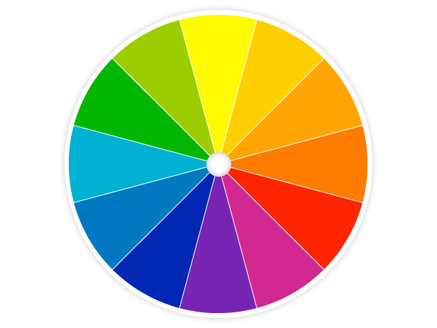
Everyone is familiar with the color wheel with it’s perfectly bright and beautiful colors. Here, blue and yellow make a vibrant green, red and blue make a vivid purple, and yellow and red make bright orange. This is all great in theory, but when you try creating these colors on your own (with paints) you’ll probably end up getting a lot of muddy colors. You may not be able to get anything near purple, green, or orange. There is a reason for this, it’s called color bias. Artist quality paints can be very expensive; so, before you go running out to buy more paint colors, let’s try to understand what’s making the mud.
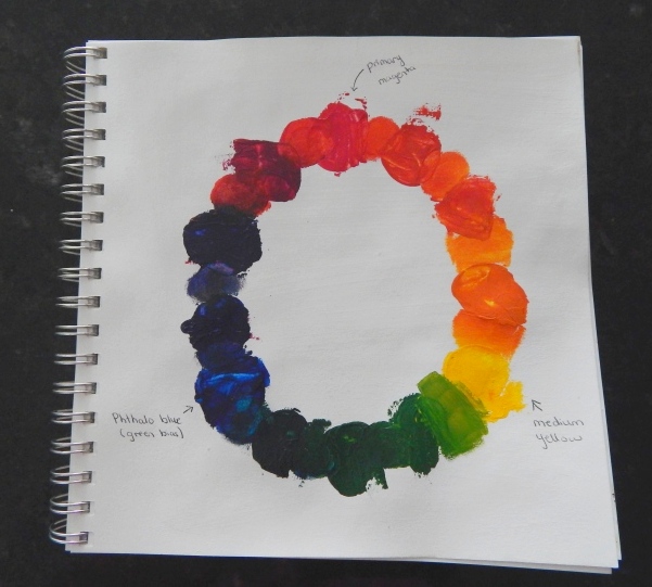
The color wheel that I created below used magenta instead of red, this is because there are two different theories regarding whether or not red is a primary color. When magenta is used you can actually mix and make a red color, and primary colors shouldn’t be able to be mixed to be created. Primary colors are supposed to be pure pigments. So, regardless of whether you use magenta or red you can make yourself a color wheel similar to the one below.
In this color wheel, I did manage to make a really nice orange, as well as a green. However, I was unable to get anything very purple. The ‘purple’ color turned out to be quite murky. It’s still purple, but it isn’t bright. The reason this muddy color was created instead of bright purple is because paints always have something called a color bias. Paints can never be a pure red, blue, or yellow- this is due to the chemicals that are mixed with the pigments.
So, when you see a red paint, it will have either a blue or a yellow bias, blue paint will have a red or a green bias, and yellow will have a green or a red bias. The bias is based on which primary color the color you’re looking at lies next to on the color wheel.
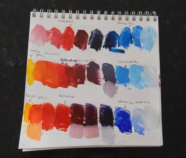
In order to understand how the paints you have are biased it’s a good idea to try mixing them together and see what happens.
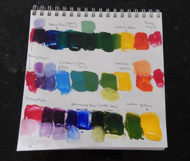
In the image above I tried mixing red with three different blues; Phthalo Blue, Ceruleun Blue, and Ultamarine Blue. The Phthalo Blue here has a slight green bias. So when I tried mixing the magenta (or red) with Phthalo Blue, it will make a muddy purple because the blue itself has a little bit of green in it. When you take all three primary colors and mix them together, you get a brown, muddy color. Since the Phthalo blue has green in it (which is next to yellow) you’re mixing red, blue, and a tiny bit of yellow together which makes a muddy purple.
I did the same color mixing with Magenta. I mixed magenta with the same three blue shades. I also mixed Medium Yellow with these blues. The biases show up clearly now:
Ultramarine Blue = red bias (good for making bright purple)
Phthalo Blue = green bias (good for making bright green)
Cerulean Blue = green bias
Medium Yellow = red bias (good for making bright orange)
Phthalo Blue = green bias (good for making bright green)
Cerulean Blue = green bias
Medium Yellow = red bias (good for making bright orange)
I hope this helps you to understand your paints more and to mix the colors that you’re actually trying to make. Play with your own paint colors to find their bias and maybe make a chart similar to the ones I have above as a reference.
© Ammara Cokar 2015

